Visualizing American democracy
2024: Every vote, visualized
View project →
Published: November 2024 | The Washington Post
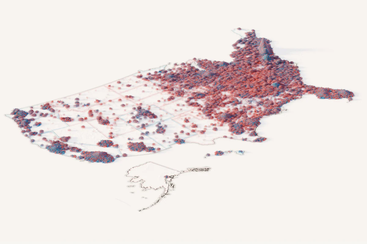
A cinematic, three-dimensional map where over 144 million votes become grains of sand, piling up by precinct to show election results as both texture and structure. The metaphor underlines how America is more unified—and individual votes still matter.
Highlights:
- Conceived the "grains of sand" metaphor, visually communicating that many individual choices contribute to a collective decision.
- Led a "stack-of-hacks" pipeline: Data analysis → QGIS → Blender → After Effects → web
- Conducted real-world studies of sand pile dynamics to inform particle behavior
- Optimized workflows to run well on tight deadlines: procedural textures, distributed cloud rendering, smart data processing scripts.
- Delivered both a digital experience and standout print centerpiece within hours of results being finalized
Additional links
2020: How political winds shifted across America
View project →
Published: November 2020 | The Washington Post
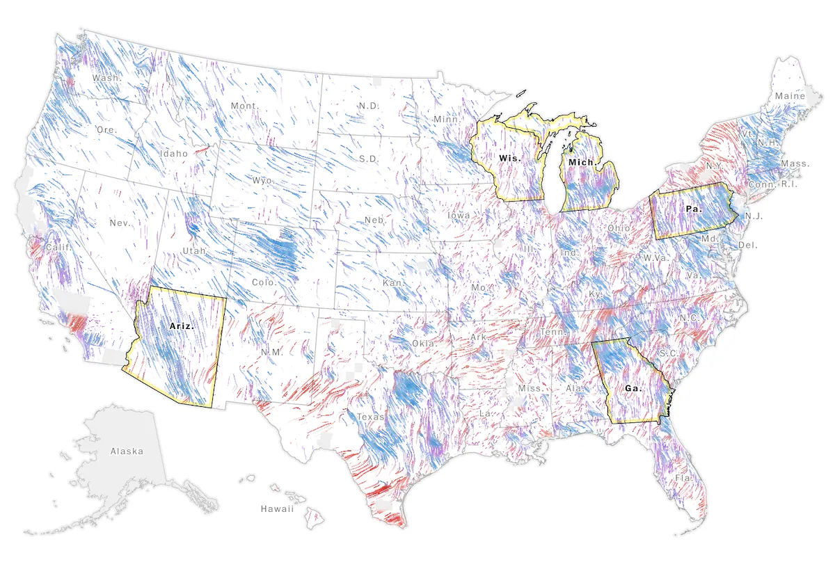
An immersive, motion-driven map using data-driven "winds" of animated particles to show shifts in vote share, turnout, and population between 2016 and 2020—creating an organic flow through political change.
Highlights:
- Originated the wind metaphor after the 2016 election as a creative framework to unite multiple datasets
- Collaborated with Joe Fox to build a QGIS→canvas vector workflow to animate particles
- Integrated turnout, vote shift, and population into a single, dynamic experience
- Led the project end-to-end: data curation, stakeholder alignment, technical build, and print adaptation