Visualizing the COVID crisis
Two projects that shaped how The Post used visualization to capture the scale and complexity of the COVID crisis.
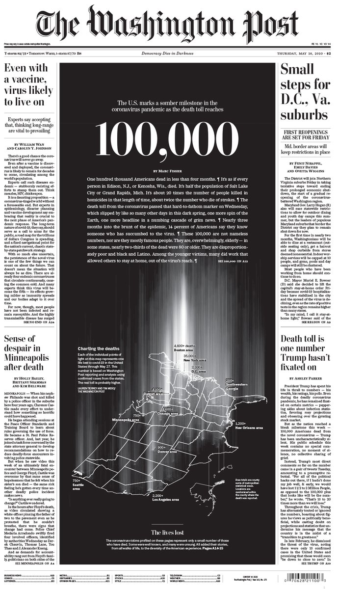
100,000 lives lost
View project →
Published: May 2020 | The Washington Post
A moving visual tribute to the first 100,000 Americans lost to COVID-19. Each life is represented as a mark in a growing vertical beam of light, conveying collective grief through solemn accumulation, while also presenting the scale of individual loss.
Highlights:
- Defined the core metaphor: a memorial column of individual marks and directed the visual pacing of the digital presentation to evoke dignified reflection.
- Anchored a high-impact front-page centerpiece, with the visual at the heart of both print and digital storytelling
A year of COVID

View project →
Published: January 2021 | The Washington Post
An interactive, map-based timeline tracing the first year of the pandemic. It intertwined national trends in infection and policy with intimate portraits and personal storytelling, bridging scale and empathy.
Highlights:
- Led the visual build of maps and graphics structured to anchor the timeline and narrative
- Balanced incomplete, evolving data with a compelling visual narrative that honored individual stories
- Aligned personalized portraits with geographic and temporal patterns to humanize the pandemic arc