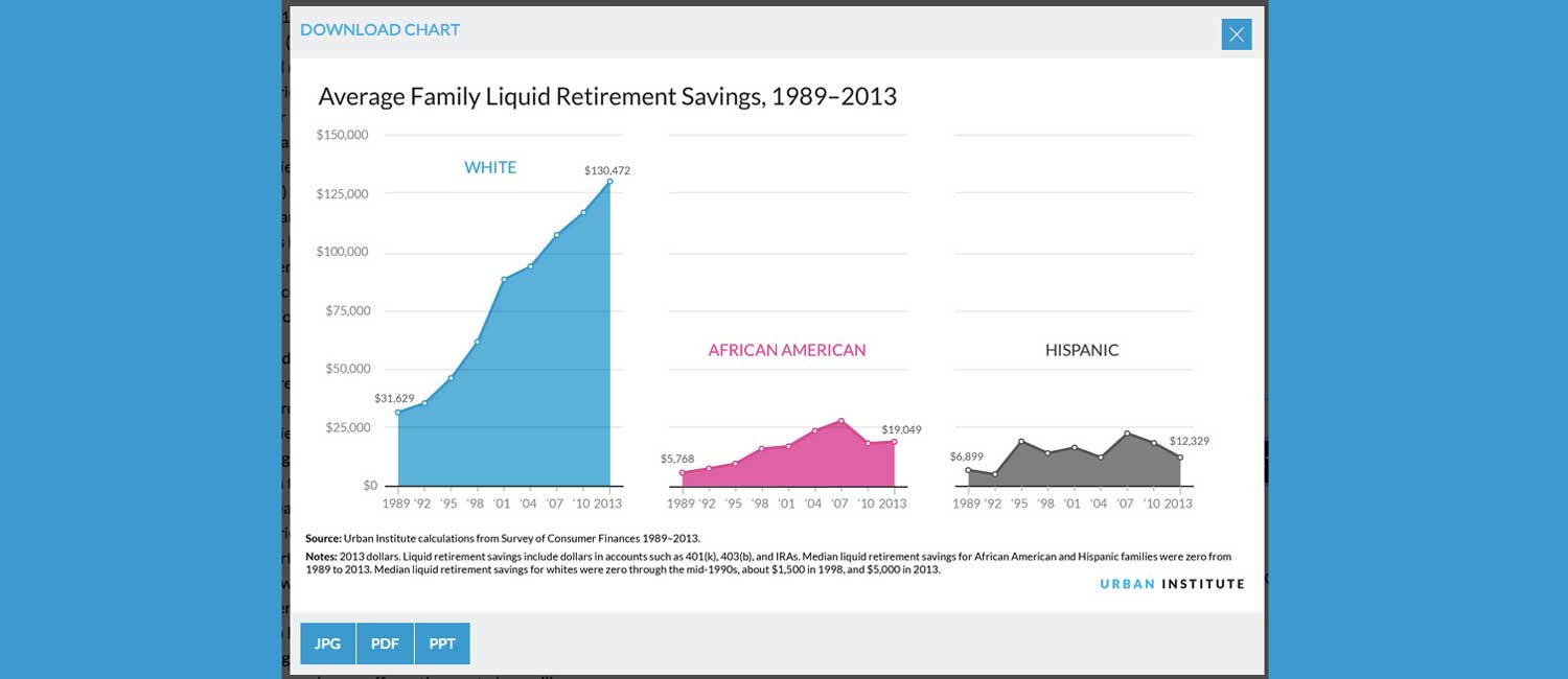
Nine Charts about Wealth Inequality in America
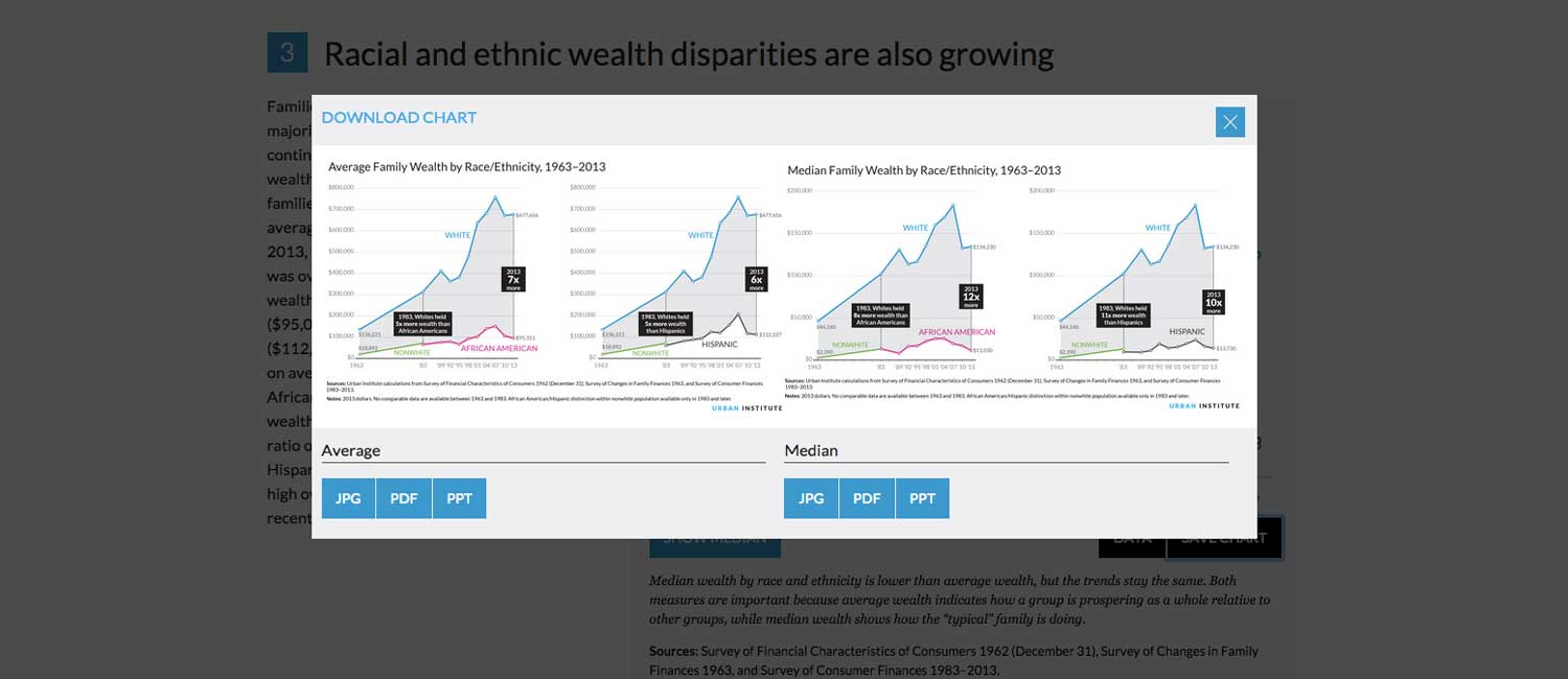
This project explored the divide between the haves and the have nots. Its goal was to shed light on the issue and to make it easy for others to spread the message. For that reason, we decided to build the charts in several formats: interactive, embedded charts that allowed users to get individual data points; and static versions that were highly designed and quickly sharable. We also provided versions in PDF, JPG, and PowerPoint formats. In addition to the downloadable charts, we provided the raw data so other academics could extend our work.